Tango Fuel Monitor System
A fleet dashboard that turns dongle telemetry, GPS position, and fuel purchase records into signals a fleet manager can act on in seconds — and a personal fuel ledger for the owner watching one car. Every screen documented here is the shipped product.
Fuel is the largest cost nobody can see
Tango Brooks Technologies builds a hardware dongle that installs inside a vehicle and reports fuel level and mileage continuously, alongside GPS position. My job was to design the dashboard that turns that raw telemetry — plus every transaction a fuel card makes — into a product a fleet manager opens every morning and an individual owner checks after every drive.
Fuel is one of the largest and most exploitable line items in vehicle operations. A driver can siphon fuel after a fill-up. A purchase can be logged that doesn't match what actually went into the tank. A route can be driven that doesn't line up with the mileage the dongle recorded. Without independent instrumentation, a fleet manager finds out when the monthly fuel bill looks wrong, months after the loss happened, with no way to trace it to a vehicle, a driver, or a trip.
Tango's business case rests on treating the dongle as ground truth. Any mismatch between fuel purchased, fuel level actually recorded, and distance actually travelled becomes visible — and it gets surfaced automatically instead of discovered by accident. I designed the product across seven areas: the fleet dashboard, the vehicle roster, single vehicle detail, refill and trip history with map playback, alerts and resolution, exporting, and notifications.
Two relationships to the same data
Fleet managers are the primary audience. They think in aggregates first: total consumption, total mileage, which vehicles are outliers. They drop into a single vehicle only when something needs explaining. Their workflow is scan the fleet, then drill into whatever broke the pattern.
Scan the fleet first, drill into a vehicle only when the fleet view flags something. Need proof, not just a flag, when they confront a driver.
Own one vehicle or a handful directly. No use for fleet rankings. Need their own vehicle's story: does spend match distance driven.
Enter only through escalation, when a discrepancy needs authority beyond a fleet manager's own resolution.
Four problems that shaped almost every screen
A discrepancy is a relationship between several numbers: litres purchased, litres the dongle recorded, mileage before and after, cost. Show them side by side and hope someone spots the mismatch, and you've built a spreadsheet with extra steps.
The dashboard carries total vehicles, consumption, a live map, rankings, top stations, and trend charts on one screen. The real problem wasn't which data points to include. It was the order a fleet manager's eye needs to move in.
The dashboard is fleet-wide. Vehicle detail, refill history, and trip playback are single-vehicle. A fleet manager drills in from the roster. An individual owner might land there directly. Both paths have to feel like one product.
A vehicle in transit needs a live, moving map. An idle vehicle needs a static pin. A trip from three weeks ago needs its full route ready for on-demand playback. The system chooses automatically from vehicle state.
Nine decisions that carry the whole product
These are the choices I'd defend in a room. Each one trades something away on purpose.
Fleet totals lead the dashboard. Rankings sit directly under them. Nothing about one vehicle appears until the fleet-level question is answered.
A search field and vehicle chips let a fleet manager spotlight one vehicle on the shared map widget without leaving the dashboard.
The fuel price per litre threshold sits on the dashboard with a toggle and a change action. Fraud sensitivity is a business call, not a backend constant.
A vehicle with a fuel card renders the card. A vehicle without one gives that space to dongle health instead of an empty placeholder.
Consumption and cost trends are tab states of the same chart component, so they always share the same time filter and visual language.
Refill and trip history reuse the same table shell at vehicle scope and fleet scope, gaining a vehicle ID and search field only when scope requires it.
The alert feed is one unified list sorted by severity, not three siloed categories. Fraud signals and routine activity share one vocabulary.
Resolve and Escalate share a single comment-and-confirm shell. Submit stays disabled until a reason is entered, for either action.
Every widget that needs a dongle degrades to the same message and a next step, instead of a blank screen that reads as broken.
Walking the shipped product, drill-down by drill-down
These are the actual screens, in the order a fleet manager moves through them.
Fleet Dashboard
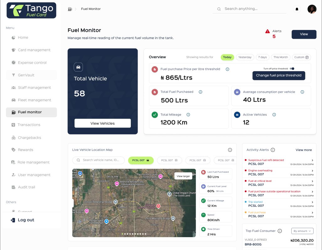
Totals lead: total vehicles, total fuel purchased, average consumption per vehicle, total mileage, active vehicle count. Nothing about a single car appears until the fleet-level question, is anything off today, has already been answered. A configurable fuel price per litre threshold sits right on this screen, because fraud sensitivity is a decision a fleet manager should be able to tune, not a constant buried in the backend.
The opening screen for every fleet manager session. Totals-first layout — fleet-wide numbers before any single vehicle.
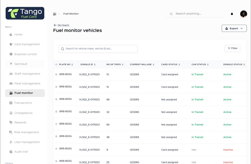
Expanded from the dashboard's vehicle count. Card status, car status (In Transit / Idle), and dongle status (Active / Inactive) are colour-coded independently — because a vehicle can be idle with a healthy dongle, or active with a dongle that's gone quiet, and those are different problems.
Single Vehicle Detail
The header answers what state this vehicle is in before anything else: plate number, dongle status, trip count, alert count, in transit or idle. An overview panel with its own date filter — Today, Yesterday, 7 days, This Month, Custom — covers fuel purchased, average consumption, amount spent, mileage, and cost per litre.
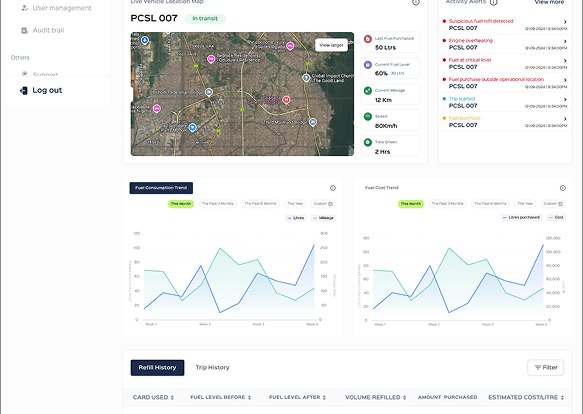
Dongle health and device status take the space a card panel would otherwise use.
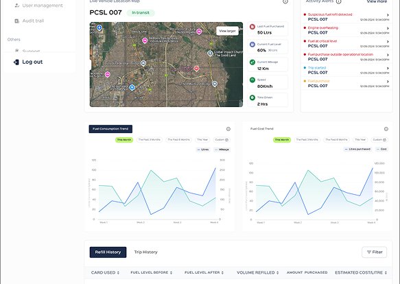
The prepaid Tango fuel card renders as an actual card, balance and cardholder included.
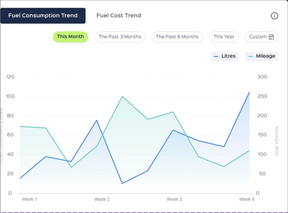
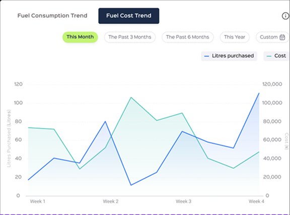
One chart component, two tab states: litres against mileage, and litres purchased against cost. Consumption and spend always share the same time filter.
Refill Logs, Route History & Trip Playback
Every refill entry carries fuel level before and after, the litre variance between the two, mileage before and after with its own variance, and the refuel location. A refill row already contains the comparison a fleet manager needs, not just a receipt.
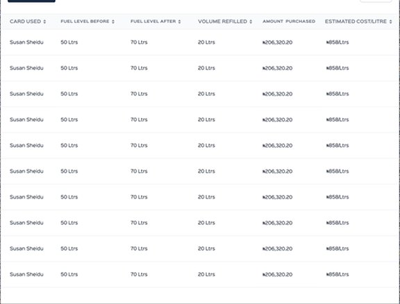
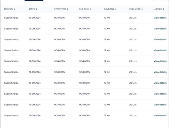
Refill History and Trip History as tabs on the same table shell. Because the vehicle is already known from context, columns stay lean: card used, fuel before and after, volume refilled, cost.
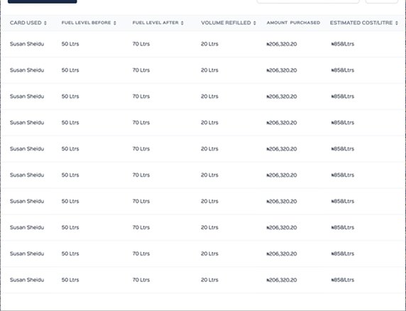
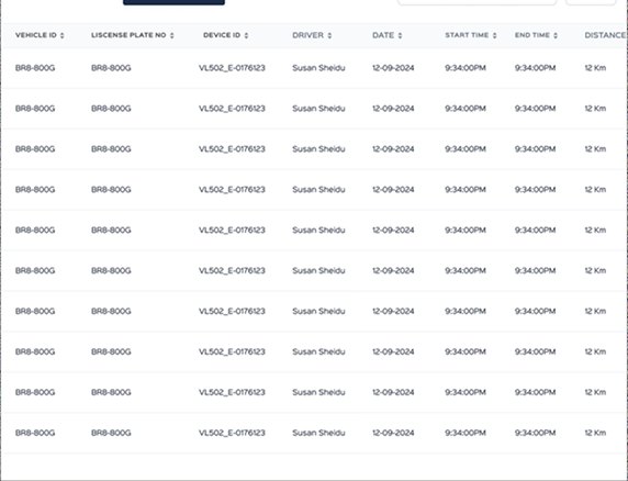
The identical component reused on the dashboard gains a vehicle ID, licence plate and device ID column, plus a search field — because at fleet scope the reader needs to know whose row this is.
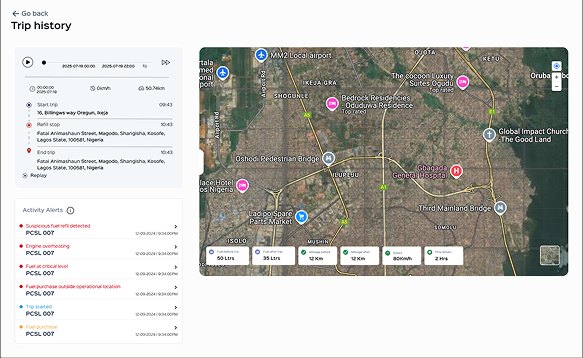
Start trip, refill stop, and end trip as a timeline with timestamps and addresses. The map strip reads fuel and mileage before and after, speed, and time driven.
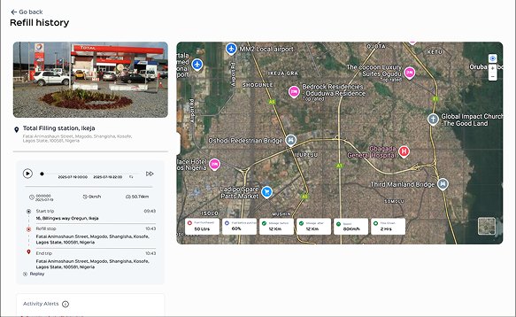
The same map-and-timeline shell, but for a refill it leads with a photo of the actual filling station — evidence that turns a disputed line item into something you can check.
Alerts & Resolution
The alerts table is a unified activity feed, not a fraud-only list. Fraud signals like suspicious fuel refill detected and fuel purchase outside operational location sit alongside operational events like trip started and fuel purchase, each carrying its own severity, so a fleet manager gets one place to scan.
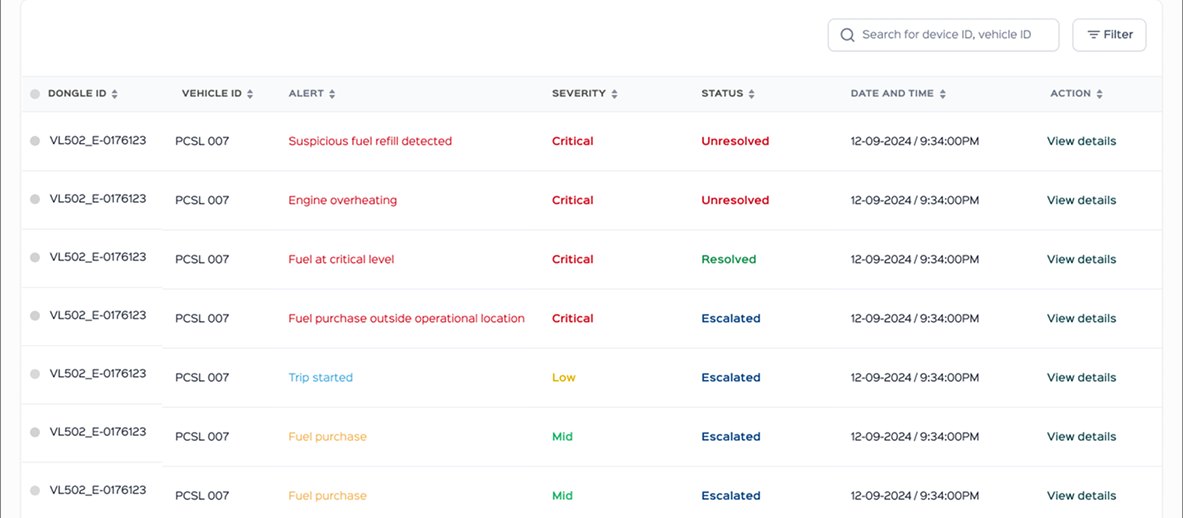
Severity and resolution status are colour-coded independently. Status reads clearly: Unresolved, Resolved, Escalated.
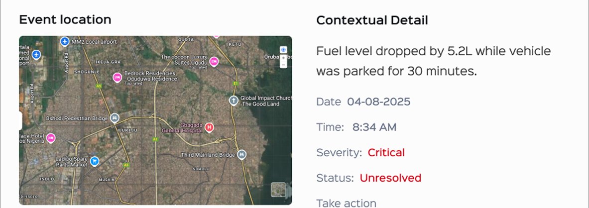
Clicking a row opens the event location on a map next to a plain-language explanation — 'fuel level dropped by 5.2L while the vehicle was parked for 30 minutes' — rather than a raw delta the reader has to interpret. Resolve and Escalate sit right there.
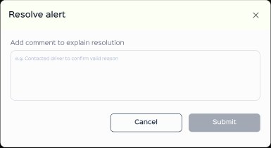
Submit stays disabled until a reason is entered.
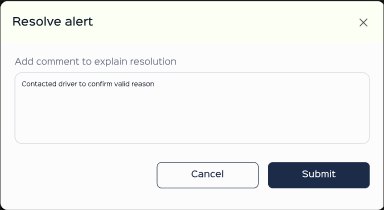
"Contacted driver to confirm valid reason."
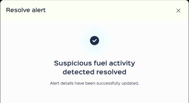
Same shell, resolved outcome.
Report Exporting & Notifications
An Export control sits in the same top-right position on both the vehicle roster and the single vehicle detail header, so exporting is always where the data being examined already lives — not a separate reporting tool that has to be found. A notification bell sits in the global header across every screen in the product. What's grounded here is the placement: export lives next to the data it exports, and notifications live in the same global position a user already checks for alerts.
What this design achieves, and what I'd still test
Every screen in this product answers one specific question. The dashboard answers "is anything wrong across my fleet." The vehicle header answers "what state is this vehicle in right now." The refill log answers "did this transaction match what happened." The alerts table answers "what needs my attention, and how urgently." Holding that one-question-per-screen discipline is what keeps a dense dataset — fuel, mileage, location, cost, time — scannable instead of overwhelming.
Component reuse across zoom levels, and the shared Resolve/Escalate shell, are the two decisions doing the most work with the least surface area. They're also why the product feels like one system across seven modules instead of seven separate tools.
Given more usage data, two things are worth testing rather than assuming. The line between a Mid and a Critical severity tag should be tuned against real fraud patterns, since sensitivity likely needs to differ by fleet size and vehicle type. I'd also want to confirm whether ranking the Top Fuel Consumer widget by absolute spend is more useful than ranking by variance from a vehicle's own baseline — which would surface a sudden change instead of just whoever has the biggest tank.