Digisign
Designing a biometric digital signature platform that eliminates fraud and builds trust at scale — from onboarding flows to audit trails.
A trust platform, not just a signing tool
Digisign authenticates every signer, signature, and transaction using biometric identity verification, liveness detection, and face comparison backed by national identity data (NIN, BVN).
At its core, DigiSign allows users to:
- Create and customize documents with signatures, text fields, checkboxes, and radio inputs etc.
- Automate workflows using Team-based workflows, supporting multi-recipient signing, approvals, and visibility, signing orders, and real-time tracking.
- Verify signer identity through secure authentication systems such as NIN & BVN.
- Integrate seamlessly with tools like Zapier and internal enterprise platforms.
I was brought on as the Senior UX/UI Designer to lead the end-to-end UX design and redesigning of the signing and identity verification workflow for DigiSign, enables users to create, send, and sign documents online, offering both cloud-based and self-hosted deployment options, which transformed complex biometric and compliance challenges into a smooth and intuitive user experience for corporate and government buyers.
This case study represents work completed at Digisign Technologies Limited. Specific metrics have been contextualised for portfolio presentation. The platform is live.
The existing digital signing experience across most platforms including early iterations of DigiSign was built around convenience, not identity assurance. While DigiSign offered a powerful platform for document creation and signing, the identity verification layer introduced friction into an otherwise simple workflow.
At first, users could upload, send, and sign documents quickly, but the system relied heavily on weak authentication methods such as email verification and OTPs. There was little to no guarantee that the person signing a document was actually who they claimed to be.
Later, DigiSign required users to complete biometric verification and identity validation (BVN & NIN) before signing. While this significantly improved security, it also created uncertainty and drop-off within the flow as about 80% of it's users from one of the firm who have adopted the use of Digisign for its loan disbursement were not digital native and questioned the legitimacy of the process.
From a product standpoint, the experience appeared complete, documents were signed, workflows were functional but from a trust and compliance perspective, there was a critical gap.
Key issues included:
- No strong identity verification: signatures were not tied to verified individuals.
- High exposure to fraud: impersonation, insider abuse, and document tampering.
- Lack of auditability: limited traceability for legal disputes.
- Fragmented workflows: verification often happened outside the signing flow.
- Low user confidence: users questioned the legitimacy of signed documents.
At scale, these issues became more pronounced in enterprise and government use cases, where the cost of a fraudulent or disputed signature is significantly higher.
The broader landscape reinforced the urgency:
- Digital identity fraud is projected to exceed $50B globally, according to Juniper research.
- According to NIBSS, fraud losses in Nigeria alone increased from ₦34.59B to ₦52.26B within a year.
- A significant portion of fraud cases stem from identity compromise and weak authentication systems.
- Despite the growth of digital signing tools, most platforms were still solving for speed, not trust.
How might we design a system that:
- Guarantees who is signing
- Prevents fraudulent transactions
- Maintains legal compliance
- Remains simple and intuitive to use
My goal was to build a platform that would:
- Eliminate identity ambiguity in digital signing
- Reduce fraud and impersonation risks
- Provide a verifiable, non-repudiable audit trail
- Simplify document workflows for enterprise users
- Integrate seamlessly into existing systems
Before design exploration began, the team aligned on several assumptions:
- Users would resist biometric verification due to perceived complexity.
- Identity verification would significantly increase drop-off rates.
- The biggest friction point would be face capture and liveness checks.
- Enterprise users would prioritise speed over verification depth.
This challenge created a clear opportunity to redefine digital signing as an identity-first experience. Instead of treating verification as a separate or optional step, DigiSign could:
- Embed identity verification directly into the signing flow
- Use biometrics and national identity data (BVN/NIN) to ensure authenticity
- Provide real-time feedback and transparency during verification
- Deliver a system where every signature is inherently trusted
Through usability testing, some of these assumptions were validated, while others proved incorrect — particularly around user willingness to complete verification when trust is clearly communicated. This positioned DigiSign not just as a tool, but as a digital trust infrastructure.
Understanding the Problem Before Solving It
Before jumping into solutions, I focused on understanding why users struggled with the identity verification flow, not just where they dropped off. The goal was to validate early assumptions and uncover the real drivers of friction within a high-security environment.
Given the nature of Digisign being a security-sensitive, enterprise-focused platform, I used a combination of qualitative and behavioral research methods.
5 Engineers and 3 Product Managers from various companies actively using DigiSign. These participants were selected because they are directly involved in integrating DigiSign into their existing systems and workflows, making them highly familiar with both the product and its real-world use cases. A mix of 20 first-time and returning users from these companies/startups — end users interacting with the signing experience.
- Open and sign a document
- Complete identity verification
- Navigate multi-step signing
These participants represent both system integrators and decision-makers (engineers & product managers) and end users interacting with the signing experience. This ensured a balanced view across technical implementation and real user behaviour.
Session recordings and interaction analysis.
- Where users paused or hesitated
- Repeated actions (e.g., retrying liveness checks)
- Drop-off points within the flow
What users do often reveals more than what they say. This helped identify hidden friction points that weren't obvious from assumptions alone.
Workshops with Product and Engineering.
- Technical constraints (biometric verification requirements)
- Compliance and legal requirements
- Fraud prevention priorities
This ensured that design decisions balanced user experience, security requirements, and business goals.
Comparative analysis of leading digital signature platforms.
- DocuSign
- Documenso
- Adobe Sign
- Dropbox Sign
- Onboarding and signing flow simplicity
- Authentication and verification methods
- Feedback systems and error handling
- Multi-party workflow experience
This analysis helped benchmark DigiSign against industry standards and identify gaps and opportunities.
- Document completion rate (sent → signed)
- Verification success rate (users who complete biometric authentication)
- Fraud detection rate (flagged vs prevented cases)
- Time to complete signing
- Drop-off rate during verification steps
- Error rate in identity verification
- User satisfaction (qualitative feedback)
- Number of verified identities
- Volume of successfully signed documents
- Reduction in fraud-related incidents
- Adoption rate among enterprise clients
What we expected vs. what we found
The research revealed a critical shift in understanding.
Users were generally willing to complete verification if they understood why it was necessary.
Breaking the flow into steps wasn't enough. Users needed clear instructions and real-time feedback to succeed.
Moments without feedback (loading, validation, completion) caused users to question: "Did this work?" "Should I try again?" This uncertainty increased drop-offs.
Users saw signing as the goal. Verification felt like an unexpected interruption, not part of the experience.
Critical biometric and liveness instructions were presented only in English, creating confusion, repeated attempts, and reliance on external assistance among non-English-speaking users.
How the insights shaped the signing & verification flow
The signing flow was redesigned end-to-end. Each design decision below maps directly to a research insight, what the signer needed, and how the new flow responded. The signing and verification experience is a single guided journey across three steps; review & sign, biometric verification, identity verification. Each shaped by the research insights.
Document Signing & Execution Workflow
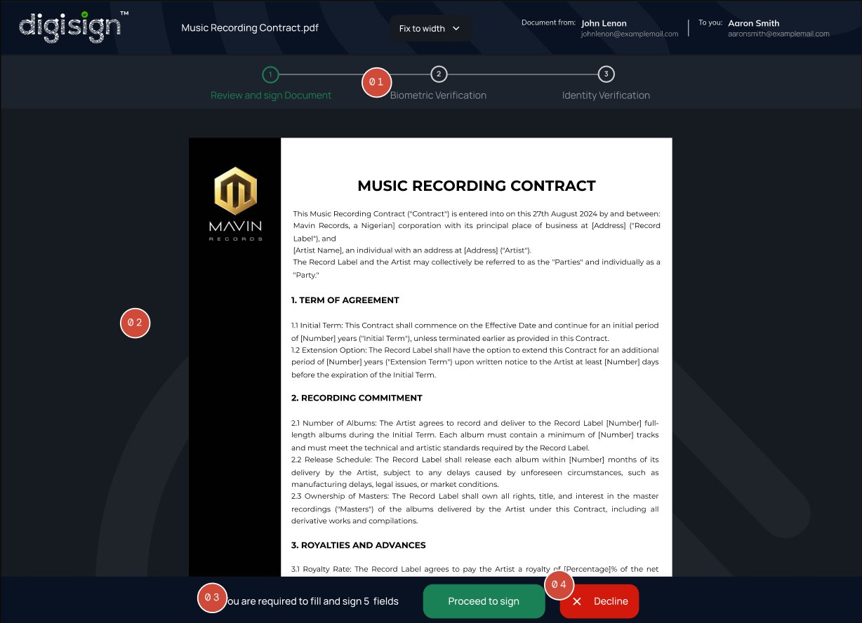
The three-step path (Review and sign → Biometric → Identity) sits at the top from the moment the document opens. Signers know the total commitment before they start — no hidden steps later.
The contract loads in full. The signer can read what they're about to commit to before any required action, which is fundamental for legal trust.
"You are required to fill and sign 7 fields" is explicit: the signer knows exactly what's expected of them. Direct response to Insight 1 — confusion, not effort, is the real source of resistance.
Proceed to sign and Decline are presented as equal options, not a primary CTA with a hidden way out. A signer who declines is exercising the same legal right as one who signs — the design respects that.
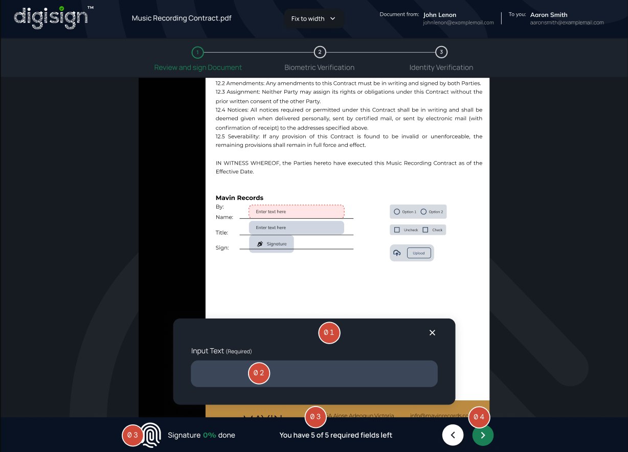
On opening, the system lifts the first required field into a focused modal. The signer does not have to search the document to find what's expected — the work comes to them.
Empty input is wide and centered with no competing affordances on the modal. One field, one focus, one decision.
Fingerprint icon starts empty as a visual companion to the percentage. As fields are completed, the icon fills — feedback that reinforces the text counter update as the signer completes inputs. No save button, no waiting, no ambiguity about whether the input counted.
Forward is enabled because there are still pages to review; back is disabled at the start. State of the controls confirms what's possible at any moment.
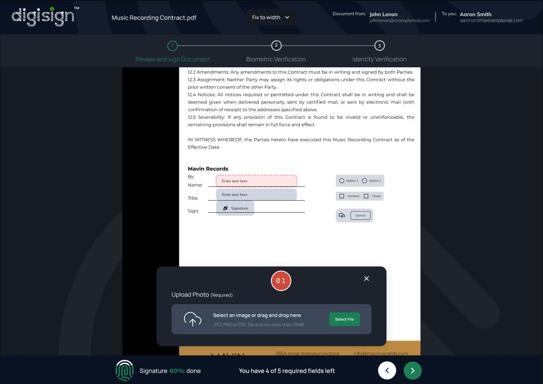
Upload uses the identical modal pattern as the text-input field. Consistent framing across input types means the signer learns the system once, not five times.
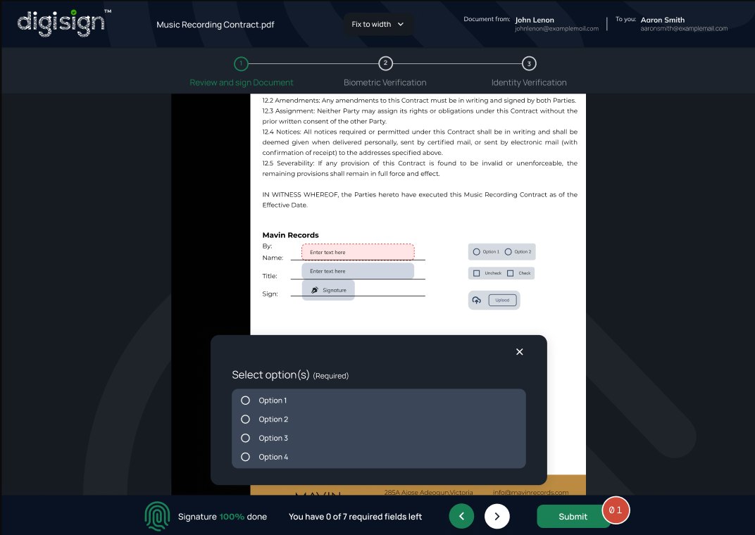
Submit is disabled until every required field is satisfied, then turns green. Removes the failure case of submitting an incomplete document and waiting for an error.
Reducing verification friction through real-time feedback
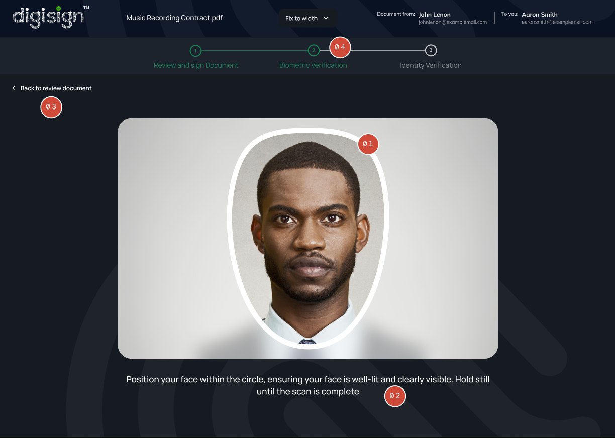
Grey oval = feedback on actions required. The signer doesn't need to read English to understand the state. Direct response to Insight 5 — for users who don't primarily speak English, colour and shape do the work that copy can't.
The guidance text doesn't change to an alarmist error message. The signer still has clear, calm direction on what to do — they were never abandoned to figure it out.
Back to review document is available at any moment during verification. The signer is never trapped in a step they regret entering.
Step 2 (Biometric Verification) begins to highlight as authentication progresses. The signer knows the journey is advancing before the next screen arrives — no silent dead ends.
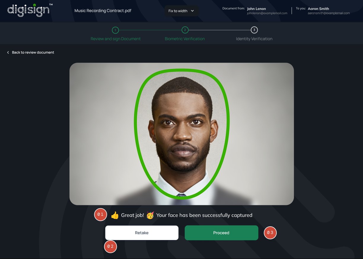
"Great job!" with celebratory emoji reframes the biometric requirement as an accomplishment, not a hurdle cleared. The same emotional design as the form-completion transition — security feels like progress.
Even at success, the signer can choose to retake the capture. The system trusts the user to know whether the image is acceptable — particularly important for legal artifacts the signer will be permanently bound to.
Proceed (primary green) is the obvious path forward. Retake is offered as a peer option but not prominent — the design respects that most signers will proceed, while protecting those who need to retake.
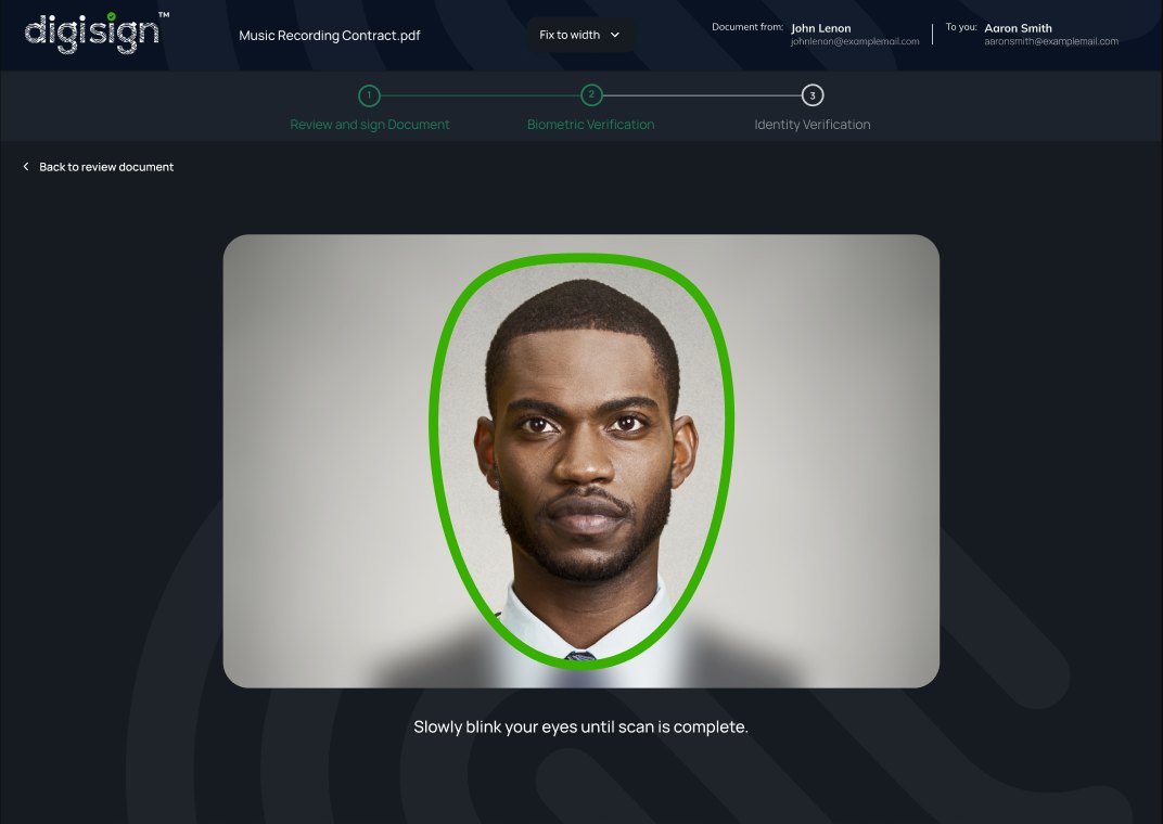
Green oval = face detected, hold position. Same shape and composition as the red error state — only the colour changes, so the signer sees the recovery instantly without re-reading anything.
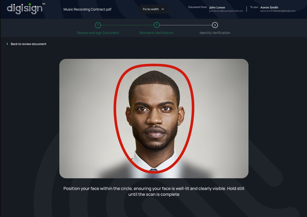
Red oval = something is wrong. The signer doesn't need to read English to understand the state. Direct response to Insight 5 — for users who don't primarily speak English, colour and shape do the work that copy can't.
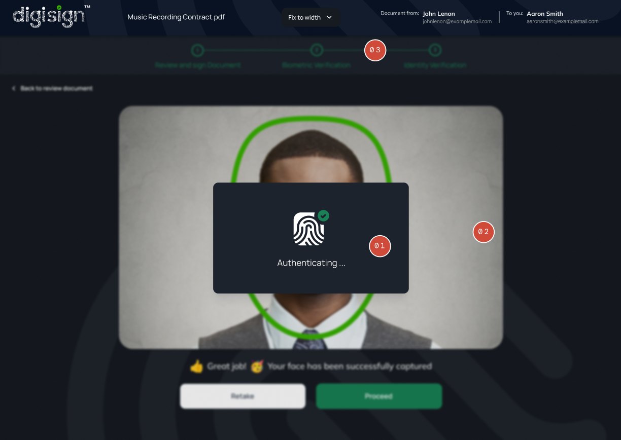
The "Authenticating…" modal uses the same fingerprint icon, same composition, and same copy as the document-signing authentication. The signer learns the system's loading vocabulary once.
The captured face stays visible behind the modal at reduced opacity. The signer can see what's being authenticated rather than waiting against a blank screen — small detail, large impact on perceived control.
Step 3 (Identity Verification) begins to highlight as authentication progresses. The signer knows the journey is advancing before the next screen arrives — no silent dead ends.
User agency in identity verification & the final, legally binding moment
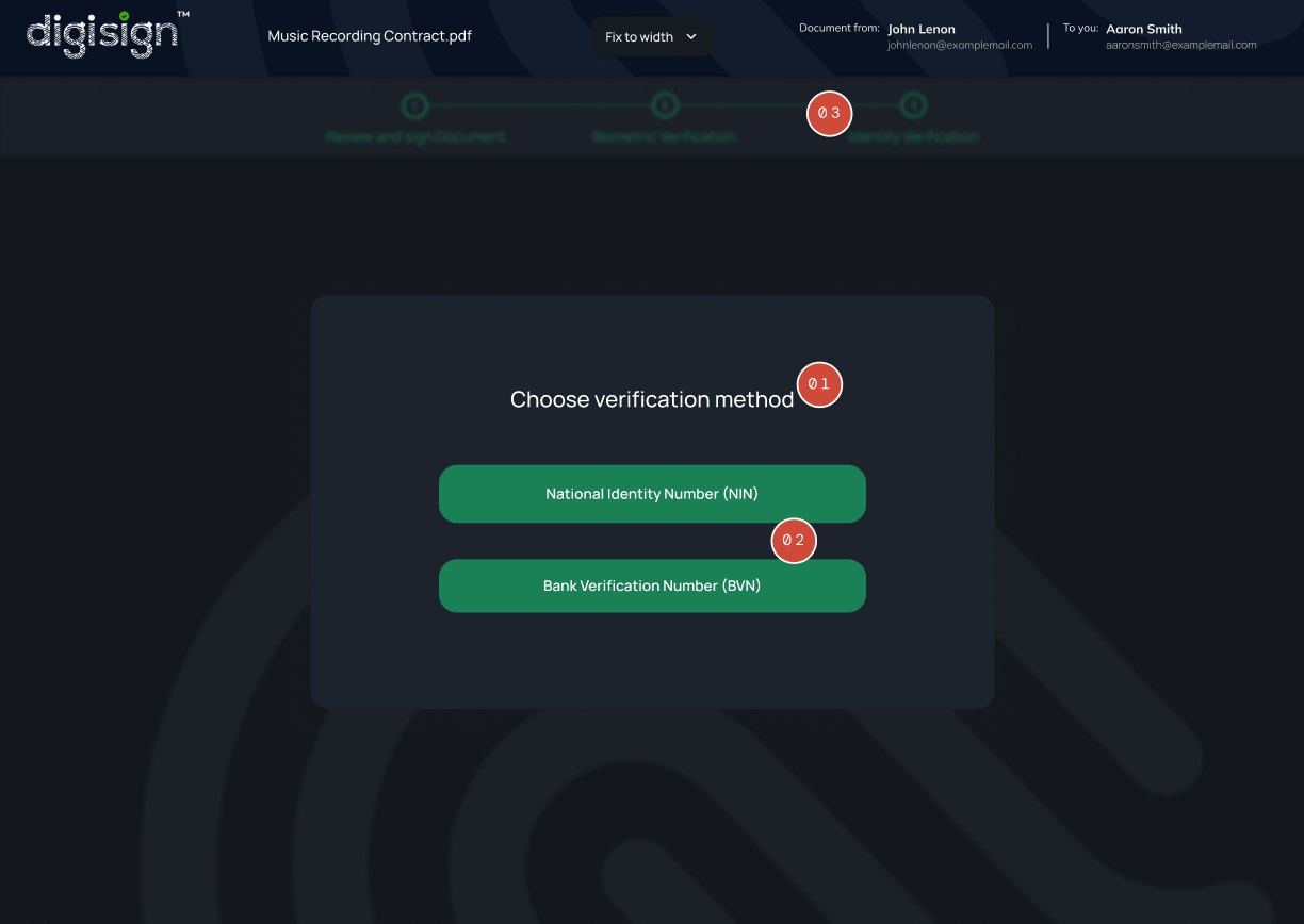
Rather than forcing a single ID system, the system surfaces the question and asks. Recognises that signers in Nigeria may have one or both of NIN and BVN — and respects that they know their own situation best.
NIN and BVN buttons share the same visual treatment and primary green colour. Neither is recommended — neither is the secondary fallback. The design doesn't try to steer the user toward what's easier for the platform.
Stepper confirms the signer is in the final stage. After two completed steps, this is the last meaningful decision before signing.
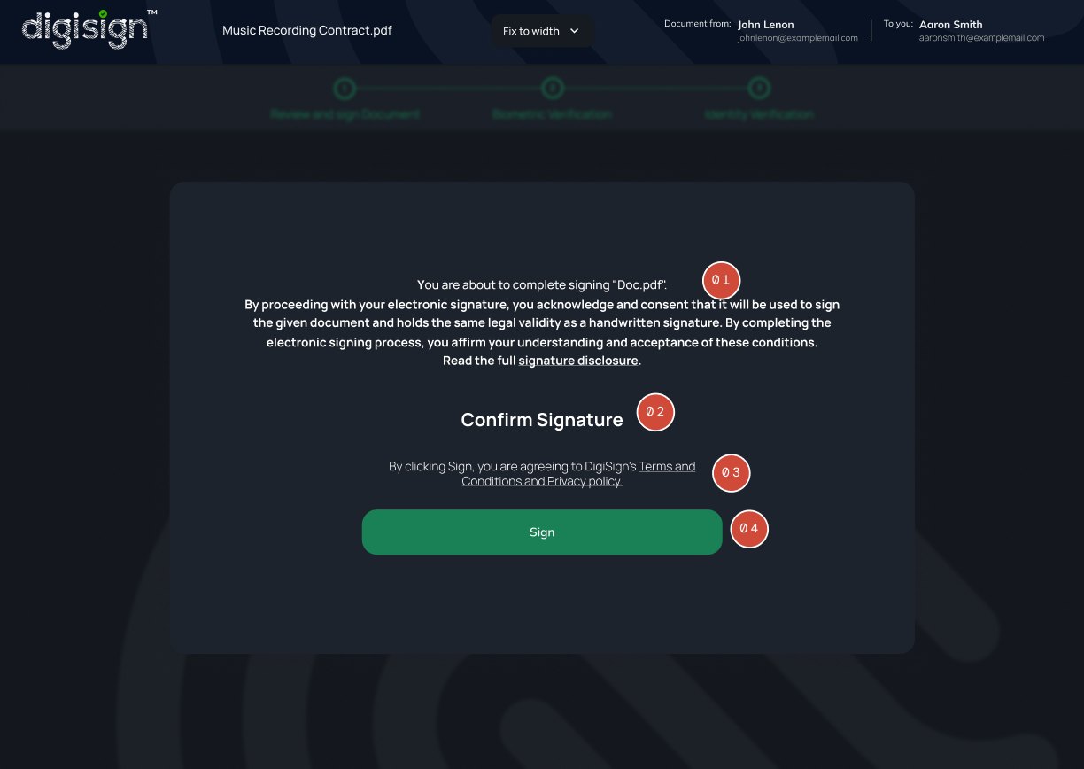
The disclaimer establishes that an electronic signature carries the same legal weight as handwritten. It's written in readable language, not a wall of dense legalese — the signer can actually understand what they're committing to before they sign.
"Confirm Signature" as a heading makes clear that the next button isn't continuing a step — it's executing the legally binding action. Naming the moment elevates it appropriately.
Terms and Privacy policy are linked inline at the point of commitment, where consent legally matters — not in a fine-print footer that almost no signer reads.
Sign is a single primary button — no Cancel or Back at this final moment. By the time the signer reaches here they've completed every required step; the design treats their intent as decided and makes the action unambiguous.
Designing for the sender, not just the signer
Signing is the most security-critical part of Digisign, but it's only half the system. On the other side, senders create the documents that signers receive. Drag-and-drop fields, multi-recipient workflows, templates, and the dashboards that track everything in motion. I designed these surfaces with the same principles that shaped the signing flow.
Sender document creation
Step 1 of 3 — the sender adds participants and assigns their roles.
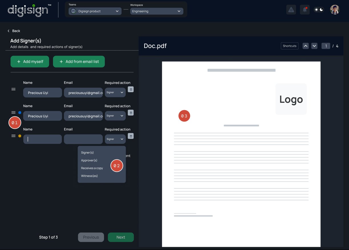
Each recipient picks up a colour the moment they're added. That colour threads forward to Step 2, where dropped fields inherit it, so the sender sees at a glance which fields belong to which signer. Identity scoping starts here.
Recipient role isn't binary "signer or not." Four options (Signer, Approver, Receives a copy, Witness) reflect how regulated workflows actually function — some participants approve before signing, others witness, others just need a record.
The document loads in full. The sender can read what they're about to send before any required action, which is fundamental for legal trust.
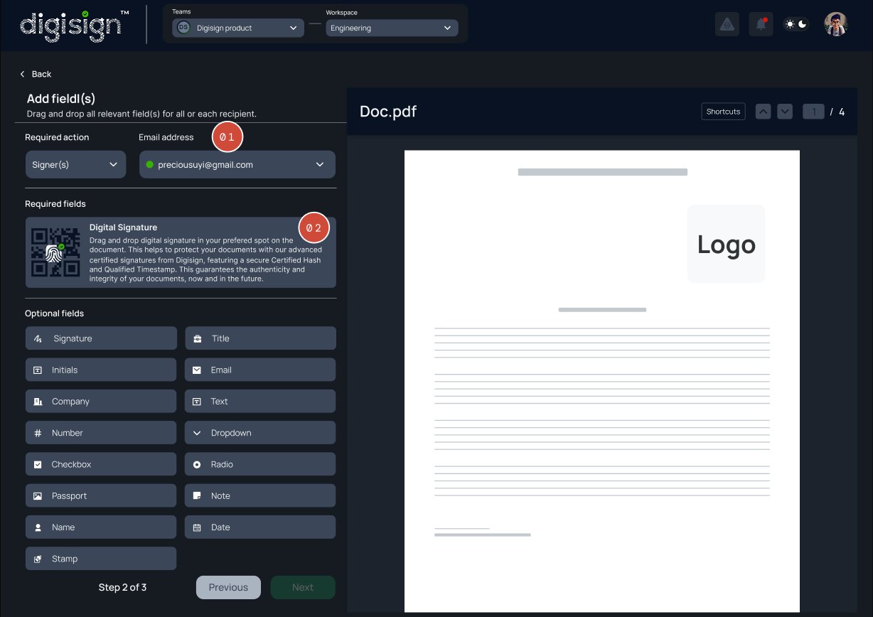
Field placement
Step 2 of 3 — fields are placed in the context of a chosen recipient.
Select the recipient before adding fields. Every field added is automatically assigned to that recipient, eliminating extra assignment steps and preventing errors later.
Required fields are separated from optional ones. Digital Signature has its own required section, with Certified Hash and Qualified Timestamp clearly highlighted to show the document's security and legal requirements.
Document configuration
Step 3 of 3 — subject, message, and terms are set before sending.
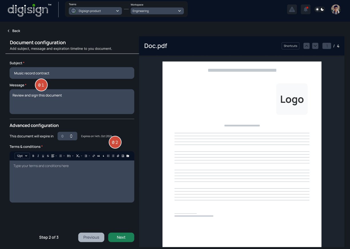
Subject and Message are both flagged required before the sender can continue. Every document a recipient opens arrives with context attached — not a bare file link with no explanation of what they're being asked to sign.
Senders can add document-specific legal terms using a rich-text editor instead of relying on generic platform terms. Expiration dates are also shown clearly as specific dates, removing the need to calculate deadlines.
The new DigiSign platform achieved significant improvements immediately after launch. In a pilot with select customers, we measured key metrics.
Average document signing time dropped from over 10 minutes to just 1–2 minutes. This aligns with industry findings that 50% of agreements can be completed within 15 minutes with e-signature.
In usability tests, 90% of users completed the signing task successfully without assistance. Time-on-task decreased by ~90% compared to the previous process. One user remarked, "It took me less than 2 minutes to send a document."
In a post-launch survey, 75% of users said the signing experience was 'easy' or 'very easy' — significantly higher than for the old system. Customer feedback highlighted the clarity of the new interface ("I immediately knew where to click").
By adopting DigiSign, the business improved compliance audits. Managers could generate reports instantly instead of searching through paper files.
These results demonstrate that the user-centered design directly impacted efficiency and satisfaction. The use of real-time tracking and notifications (valued by nearly half of e-sign users) was cited by customers as a "game changer". Overall, DigiSign helped the organization move toward the 77% of companies that consider e-sign essential for resilience.
This project underscored the importance of empathy and clarity in UX. One key learning was that education matters: many users were unfamiliar with digital signature concepts, so we improved the onboarding tutorial to briefly explain "Why DigiSign is secure." In future work, we plan to iterate on the onboarding flow (perhaps adding short tooltips) to further reduce the learning curve.
Another insight was balancing legal requirements with simplicity. Working closely with the compliance team, I learned how to translate legal jargon into plain language and UI cues. For example, instead of showing a "certificate serial number," we display a simple reference code. This taught me to see the design from a user's perspective first, then layer in technical details only as needed.
Given more time, next steps would include enhancing collaboration features (commenting on documents), integrating with CRMs, and expanding analytics (so admins can see signing trends). Additionally, continual usability testing with real-world users will be vital: early tests focused on core flows, but long-term success will come from ongoing refinement based on feedback.
Overall, the DigiSign case study highlights how thoughtful UX design can translate complex technology into an accessible tool that drives real business impact. By focusing on user needs, conducting iterative testing, and grounding decisions in research, we delivered a solution that is not only functional but also trusted and embraced by users.