Princeps Sales Channel
A role-based dashboard system that turns siloed sales data into a real-time intelligence layer — giving every level of the organization exactly the view it needs, no more and no less.
The "black box" of sales performance
Prior to this portal, sales data was siloed. Sales Officers had no visibility into their loan applications once submitted — the status of a loan after it left their hands was a mystery.
Management relied entirely on end-of-month aggregation. Decision-making happened in arrears. There was no mechanism to course-correct mid-cycle, and no way to correlate outreach effort with outcomes.
Sales Officers couldn't track their loan applications in real time (New → Processing → Disbursed), leading to anxiety and poor customer communication.
Unit Managers manually aggregated data to monitor multiple teams, making it hard to adjust strategy quickly. End-of-month reports were the only view.
Call logs and follow-ups were disconnected from the tracking system, making it impossible to correlate outreach efforts with results.
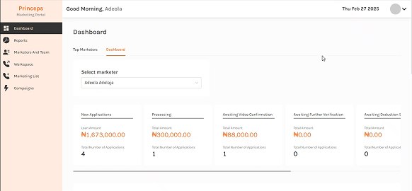
Dashboard: all data gated behind a manual marketer-select dropdown. Pipeline cards in horizontal scroll — stages hidden off-screen.
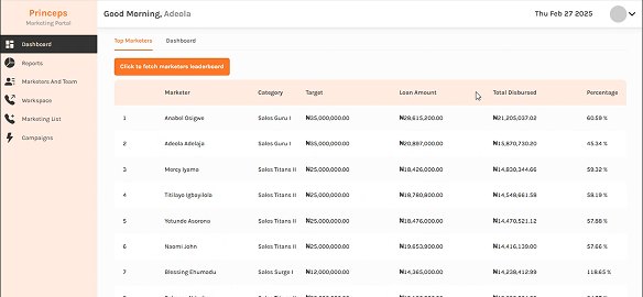
Top Marketers tab: leaderboard required clicking 'Fetch marketers leaderboard' — not visible by default. No visual ranking treatment.
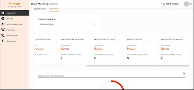
Continued scroll revealed 5+ more pipeline stages. Target gauge only partially visible.
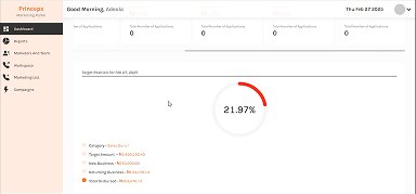
Target position: one marketer, one gauge, buried below fold. 21.97% — no peer comparison, no color-coded threshold.
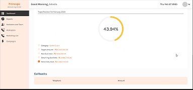
Callbacks section below the gauge — disconnected from pipeline and performance data, no correlation possible.
Every data view required selecting a marketer by name. No aggregate overview existed.
8 loan stages hidden in overflow scroll. No stage counts visible without scrolling.
Target position lived below the fold, one marketer at a time, with no peer comparison.
Rankings required a manual button click to load — invisible by default.
One platform, four levels of access
The discovery phase revealed a strict organizational hierarchy that would define every design decision. Each role had fundamentally different data needs and the portal had to serve all four without leaking information across boundaries.
Personal targets, individual loan tracking, commission visibility.
Team call logs, assistance with approvals, team performance.
Disbursement trends across multiple teams, strategic analysis.
Company-wide reporting, performance rewarding, export capability.
Architecture before aesthetics
With four distinct roles came four distinct views of the same underlying data. The hardest design challenge wasn't visual — it was structural. Before a single screen was touched, I mapped every feature against every role.
The result was a Role-Based Access Control (RBAC) permissions matrix — a living document that became the source of truth for both the design system and the engineering implementation. Every navigation item, every data field, every action button was gated by this matrix.
The central challenge: how do we show a Unit Manager detailed data for all teams under them, while restricting a Sales Officer to only their own record?
The solution was a navigation system that adapts to the logged-in role. The "Team Performance Report" is visible to Team Leads (scoped to their team) and Unit Managers (scoped to their unit), but hidden entirely from Sales Officers.
I prioritized a widget-based layout for the dashboard so every user lands on the most relevant data without needing to navigate first. Time-based filters (Today / This Week / This Year) were baked in from the start to support both tactical and strategic analysis from a single view.
Color-coded visual indicators — Red for Below Target, Green for Achieved — were defined as a system-wide convention early in the process so users could gauge standing at a glance without reading every number.
Four modules, one coherent system
Each module addresses a specific pain point from the discovery phase — individually useful, but designed to function as a unified workspace.
The core interface is a dynamic dashboard that serves as the single source of truth. Metric cards surface total sales, loan amounts, and commissions. Line and bar charts visualize disbursement trends over time. A prominent progress bar compares Actual vs. Target for sales and call logs.
To solve the "black box" issue, a kanban-style loan status view updates in real-time as a loan moves from Processing → Awaiting Disbursement → Disbursed. Users can filter by new applications, status, or date range.
The Request Manager gives Officers a dedicated channel to raise requests (e.g., unblocking a number) that route to Team Leads for approval. A call-logging interface captures outcomes ("Not Interested", "High Interest Rate") that feed into the Call Log Report.
A sales leaderboard ranks officers, teams, and units on performance metrics. Gold/Silver/Bronze visual highlights recognize top performers, directly addressing the executive need to reward excellence and sustain motivation.
The screens in detail
Six key screens across the four modules, each demonstrating the role-adaptive system at a different permission level.
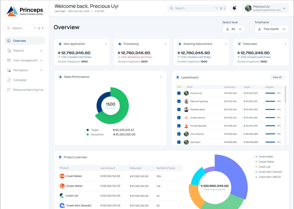
All-level overview: pipeline status cards, sales performance donut, and company-wide leaderboard. Visible to Unit Managers and Executives.
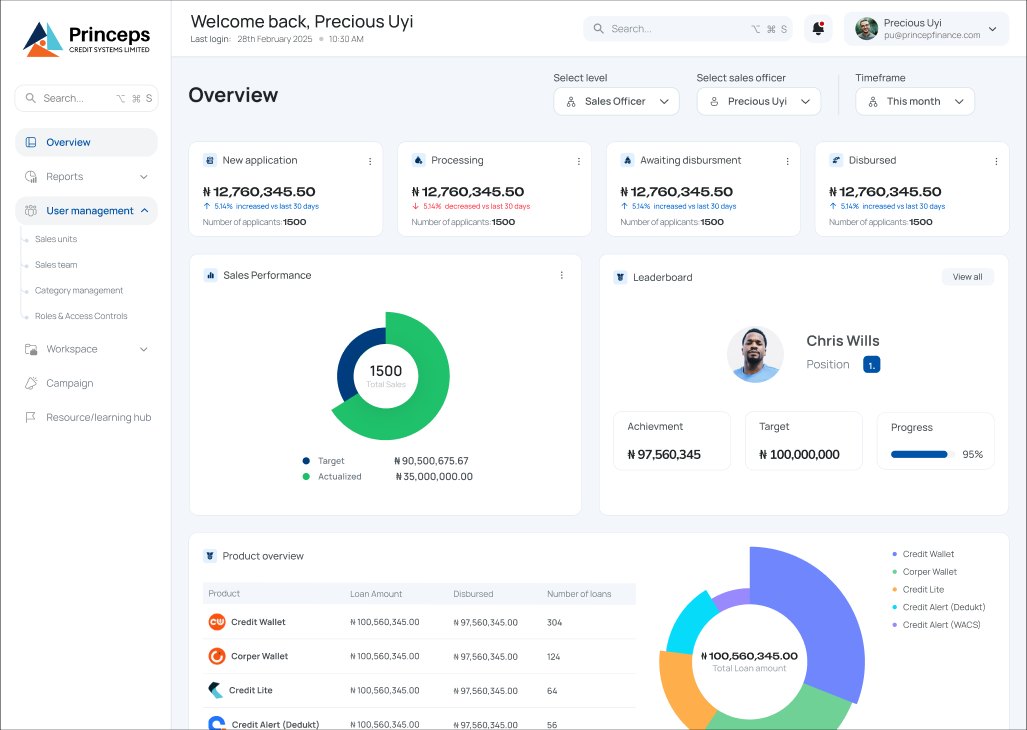
Sales Officer level view: the leaderboard surfaces a featured card for the current user (Chris Wills, rank 1, 95% target achievement) so performance context is always present.
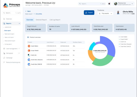
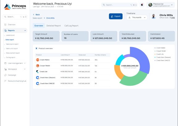
Individual sales report for Chris Wills: target ₦13.76M, 15 active loans, and a product breakdown table with donut showing distribution across 5 products.
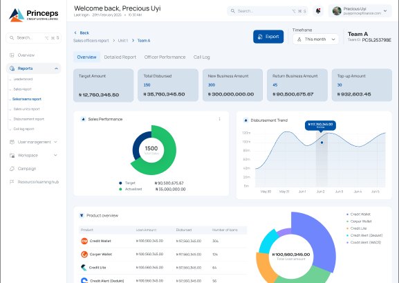
Sales teams report Team A: five metric cards, sales performance donut, and a disbursement trend line chart for tactical and strategic analysis.
Request Manager workspace: Processed tab showing 8+ entries with initiator, type, and action columns — connecting call-log outreach to approval workflow.
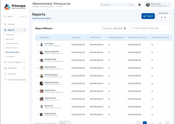
Disbursement report: Sales Officers table with loan count and disbursement value columns. Supports Excel export for Executive-level reporting.
A reporting tool that became a live workspace
The Princeps Sales Portal successfully centralized the entire sales operation. What had previously taken days of manual aggregation — company-wide performance reports — can now be generated in seconds via Excel export.
The system handles thousands of concurrent users across large datasets with real-time updates, eliminating the latency that had previously made course-correction impossible within a sales cycle.
A Resources/Learning Hub embedded directly in the portal reduced onboarding time for new agents — training materials are accessible in context rather than in a separate system.
The leaderboard drove behavioral change: visibility into relative ranking shifted agents from passive reporting to active performance management within the first cycles of use.
Designing a single interface that morphs across four permission levels required a permissions matrix before any wireframe. State-management logic and engineering communication had to be built into the design process from day one, not treated as implementation detail.
The difference between a reporting tool and a workspace is actionability. Adding "Action" buttons in the Request Manager, color-coded target alerts, and a leaderboard turned the portal from a static report into something people engage with daily. Insight without action is just display.